
How to read a chart without fooling yourself
Why patterns appear whether or not anything is there, what a chart is genuinely useful for, and what our own systems read instead — because they never look at one.
A price chart is a picture drawn for a human eye. That is its strength and the whole of its problem: the eye is extraordinarily good at finding shapes, including in places where no shape was put.
This guide is not an argument that charts are useless. It is an argument that most of what people believe they are seeing in one is produced by the looking rather than by the market — and that knowing the difference is what separates a chart used as a tool from a chart used as a horoscope.
1. The same prices will support any story you bring
Below is a single series of prices, drawn three times. Each panel annotates it as a different textbook pattern. All three annotations fit, because a pattern drawn after the fact is a description of what already happened, not a statement about what comes next.
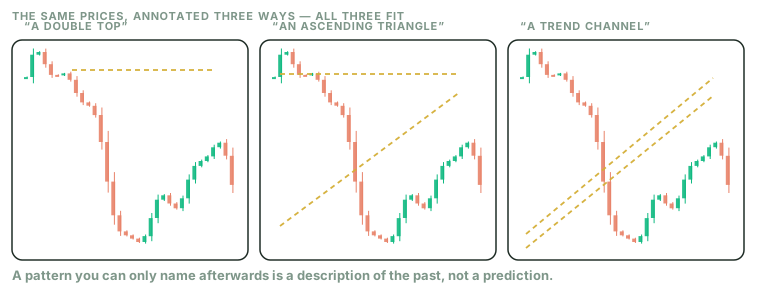
Human beings find structure in randomness reliably and involuntarily — the effect is well established across decades of work in cognitive psychology, and financial charts are close to an ideal stimulus for it: a noisy line, high stakes, and a strong desire for the next part to be knowable. Amos Tversky and Daniel Kahneman's research programme, which produced prospect theory among much else, documented how systematically people misread randomness as pattern.
The practical test is uncomfortable and worth doing once: take a chart you find compelling, cover the right-hand third, and write down what happens next. Then uncover it. Do that twenty times and you will have a more honest estimate of your pattern reading than any amount of studying will give you.
2. What a chart is actually good for
Three things, none of which is prediction.
Context for a number you already have
Knowing that a price is near the top or bottom of its own recent range tells you something about how much room your position has to move before it hits the level where you said you would act. That is scale, not forecast — and it is genuinely useful.
How agitated this thing has been
A line that moves violently and a line that drifts require different position sizes for the same amount of risk. You can see that at a glance, and it is one of the few things the eye reads accurately from a chart.
Where the events were
Marking earnings dates, product launches, or policy decisions on a chart connects price movement to causes you can name. This is the opposite of pattern reading: it starts from a real event and looks at what followed, rather than starting with a shape.
Notice that all three are answering questions about your own decision — size, distance to exit, what event drove a move. None asks the chart what the price will do, because that is the one question it cannot answer.
3. What our systems read instead
Here is the honest version of a difference we could easily oversell. myMTree's bots do not look at charts. Not because a chart is beneath them, but because a chart is a rendering — a picture drawn from the underlying numbers for the benefit of an eye. The numbers are already there; the picture is a lossy translation for a reader who cannot hold columns of them in their head.
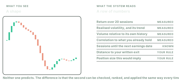
So a system reads the quantities directly. How much something moved over a defined window. How agitated it has been relative to its own history. Whether volume is unusual by its own standard. How correlated it is to what you already hold. How many sessions until the next scheduled event. How far the current price sits from the exit you wrote down, and what position size that distance implies.
Every one of those is a number with a definition, computed the same way each time. That is the entire advantage, and it is worth being precise about what it is and is not.
What this does not mean
It does not mean the machine predicts better. Nothing in this guide, and nothing on this site, claims that reading data rather than pictures produces better forecasts. The literature on retail trading outcomes — Barber and Odean on US brokerage accounts, Barber, Lee, Liu and Odean on the entire Taiwanese market — is about how much people lose to costs and behaviour, not about which visualisation format wins.
What it does mean
Three things, all of them mundane and all of them the actual point. A defined quantity can be checked: you can look afterwards and see exactly what the system saw. It can be ranked: forty candidates measured the same way can be ordered, which a wall of forty charts cannot. And it is applied identically at nine in the morning and at four in the afternoon of a bad week — which is the difference the whole platform exists for, and which has nothing to do with cleverness.
A chart is a fine way for you to understand one position. It is a poor way to compare forty, and a dangerous way to make the same decision twice.
4. If you do read charts, read them like this
Decide what would change your mind before you look, not after. Charts are unusually good at supplying evidence for whatever you already suspect, because there is always another timeframe on which the opposite is true. If a pattern is only visible on one particular zoom level, you have found a property of the zoom, not of the market.
Then attach the picture to a number. "This looks strong" is not usable. "This is near the top of its three-month range, it has been unusually agitated for a fortnight, and my exit would sit below the recent low" is a decision with an exit already in it — and it can be reviewed later, which is the only property that makes anything a learning experience.
Where to practise this
Cover the right-hand third of a chart, write your prediction, and check it. Do it on a paper account so that the twenty attempts it takes to get an honest estimate of your own skill cost nothing. That is what the paper ledger is for.
Free PDF
Download this guide as a PDF
Including the three-panel pattern figure and the list of what a system measures instead.
The research
- Kahneman & Tversky — Prospect Theory (1979)Econometrica. The programme that documented how people misread randomness.
- Barber & Odean — Trading Is Hazardous to Your Wealth (2000)Journal of Finance.
- Barber, Lee, Liu & Odean — Individual Investor Losses (2009)Review of Financial Studies. The whole Taiwanese market.
Worth reading
- Daniel Kahneman — Thinking, Fast and Slow (2011)The general-audience account of the same research.
- Nassim Nicholas Taleb — Fooled by Randomness (2001)On mistaking noise for skill.
myMTree is a research and education platform operated by RV Technology Consulting LLC. This article is general educational information, not investment advice, and not a recommendation to buy or sell any security. It does not account for your circumstances, objectives, or risk tolerance. Investing involves risk, including the possible loss of principal. Consider speaking with a licensed financial adviser before making investment decisions.